During the last week I was at the Webshaped conference listening Stephen
Hay’s talk about responsive design workflow. This post isn’t going to be strictly about that, but as
Stephen’s way reminded somewhat the way I work myself, it made me want to write down some thoughts about my
workflow and how it has evolved during the past two or three years and how it might still evolve in the
future.
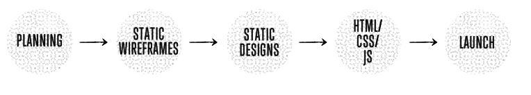
About three or four years ago—when I mostly did just static width sites—my projects went through the
different phases in the order illustrated below, which looks like a typical waterfall process. Back then
there wasn’t much room for revisions, and what clients saw were either the wireframes or almost finished
Photoshop designs.
That model kind of used to work back then, but now there’s just one problem. Waterfall model
doesn’t make that much sense when combined with responsive design. Actually it wasn’t ever very optimal way
to do web design, but as I and everyone around me were so used to delivering things in that specific order
we never really tried to challenge that.
Couple months ago while I were designing a website I remembered a technique I had long forgotten. I used to
use this technique before I moved from print design to web design about eight years ago and it was, for me,
an essential way to utilize modular grids better. Grids in design are kind of like the
scales in music. They give you a way to anchor your
layout elements and typography to a certain rhythm.
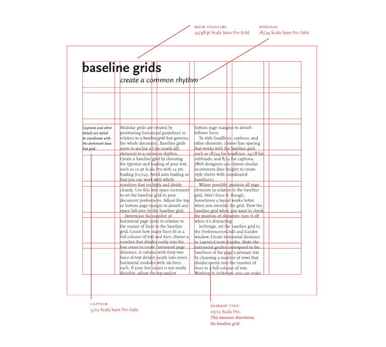
A modular grid is a grid which has consistent horizontal divisions from top to bottom in addition to
vertical divisions from left to right. Modular grids are created by positioning horizontal guidelines in
relation to a baseline grid that governs the whole document. Baseline grids serve to anchor all (or nearly
all) layout elements to a common rhythm. [1]
CSS is designed primarily to enable the separation of content from presentation, including elements such as
the layout, colors, and fonts. This separation improves content accessibility and provides more flexibility
and control over the presentation. CSS is quite flexible language on its own, but as websites become more
and more complex we sometimes need to have more control.
I’m using Sass to extend the basic behavior of CSS and this post is
mostly about some basic things I’m using. I’ll also assume that you know something about Sass already and
that’s why I won’t dive deep into what it actually is. If you are running OS X, you can get Sass up and
running using these two commands below. The first one installs Sass Ruby gem and the second one translates
your .scss file into a .css file.
Recently I started testing how proportional scaling of bigger layouts would work in reality and if it makes
any sense. It’s possible when using
EM units and then changing body’s font-size
when viewport’s height grows above certain point. Basically that means, that I have to change only one or
two css properties between @media queries which are targeting larger screen sizes.
The reason why I started doing this, is that I wanted to rethink my current approach to responsive design
and try something which would make the process at least a bit easier.
Warning: You’ll need to view my demo on
at least 24" or 27" monitor with 1920×1200
resolution or bigger. Otherwise you won’t see this method in full effect and it might be harder to
understand the benefits.
There seems to be some confusion about these terms and what they mean, so here’s my thoughts on the subject
and few links to back them up. I’m usually not very keen when it comes to debating over what something is
called, but this time I wanted to make it clear, as I hear this question quite often.
Resposive design is a subset of adaptive design. Responsive design is fluid layout only, while adaptive
design is fluid layout combined with progressive enhancement.
“Responsive design” is a subset of a larger concept which is called
“Adaptive design.” When talking about responsive we refer to the layout only (Ethan Marcotte, fluid grids,
flexible images & media queries).
“Adaptive design” on the other hand includes much more than just
fluid layout. In practice it means the same thing as
progressive enhancement, which means in short, that we aim to
deliver the best possible experience to the widest possible audience. Also: “Adaptive design” shouldn’t be
mixed with “Adaptive layout” which is a completely different thing.
I have been intrigued by the idea of making a typographic scale out of a musical scale that would not only
be very readable, but also aesthetically pleasing. This whole idea started after the launch of my new site.
At first, I ignored to see it, but weeks later I started to notice that the textual content of the site is
actually pretty harsh for the eyes and the reading experience isn’t that great.
You can read it—I’m quite sure of that—but the longer you browse the content, the more your eyes start to
hurt. Literally. One reason for this is the contrast between the text and the background, but
there’s also more to it than just that, so I started wondering:
How could I improve it?
How to make building of responsive typography easier?
Can typography look good and be readable on so wide range of devices?
Are there any patterns where I could base my decisions on?
I created another responsive jQuery plugin during the Christmas holidays. It’s called
TinyNav and it can convert <ul> or
<ol> based navigation to a dropdown for small screen.
TinyNav.js is a tiny jQuery plugin (304 bytes minified and gzipped) that converts
<ul> and <ol> navigations to a select dropdowns for small screen. It
also automatically selects the current page and adds selected="selected" for that item.”