I’m happy. I’ve been succesfully running
my design studio for the past 8 months and recently
moved into a new office space. Since then I’ve been setting up the workspace to suit the way I want to work
and create things. This dedicated quiet space gives me the luxury to focus and get much more done than I
could get anywhere else before.
A dedicated quiet space gives me the luxury to focus and get much more done than I could get anywhere else
before.
While I find myself constantly switching between different working modes like running a design systems
workshop, working at client’s premises, or doing a remote meeting with a team in another city, I like having
this personal space where I can come back to think and focus. A space for exploration and tinkering.
My workspace is a part of a bigger office, but with a dedicated room and a door. This is what my setup
currently looks like (click for bigger photos):
March, 2017. We were still living in the United States. It was a time of great anxiety for us. Just a couple
weeks earlier I had been laid off from my previous job in
California, Donald Trump had become the president,
and we were suddenly living in this foreign country without valid Visas and no plans for the future
whatsoever.
At the same time, in the middle of everything, I had this crazy idea to start up my own design studio when
we’re back in Europe.
There we were, about to have a baby, not able to
fly back to Europe anymore and trying to figure out
what’s going to happen next. The company I used to work for got sold and our previous Visas couldn’t be
transferred, which basically got us here. Just a week before all this started, I remember discussing with my
wife how I could see us growing old in this country.
For a moment it felt like a bad dream in which we were fugitives living on enemy soil. In some ways, that
dream felt real and vivid to us. I mean, it sounds frankly awkward when saying it out loud now, but back
then so many things happened at once. I wasn’t even sure if it was legal for us to stay in the country after
our Visas expired, so I tried to keep my mouth shut as well as I could. If anyone asked;
It was good. It was all going so good.
For the past year(s) I’ve been chasing for answers. Looking for new tools, thinking about
design processes and
figuring out what design really
means to me. At times I’ve felt so
disconnected with our processes that I’ve wondered if my career choice was right.
Our canvas is infinite, but the tools we use force us into thinking about pages instead of systems
of components or materials to build with.
For a field rooted in the fine arts this period of change has been increasingly hard and is about to get
even harder. We’ve moved away from designing static pages to creating digital
systems of components, but we’ve done that mostly by
using the same static design tools like
Illustrator,
Sketch, or even Figma. Tools
that haven’t changed on a fundamental level in the past three decades.
Now, I think there’s something wrong with that picture. Our design products are becoming more and more
dynamic, but our tools still treat them as blank canvases to paint on. Why?
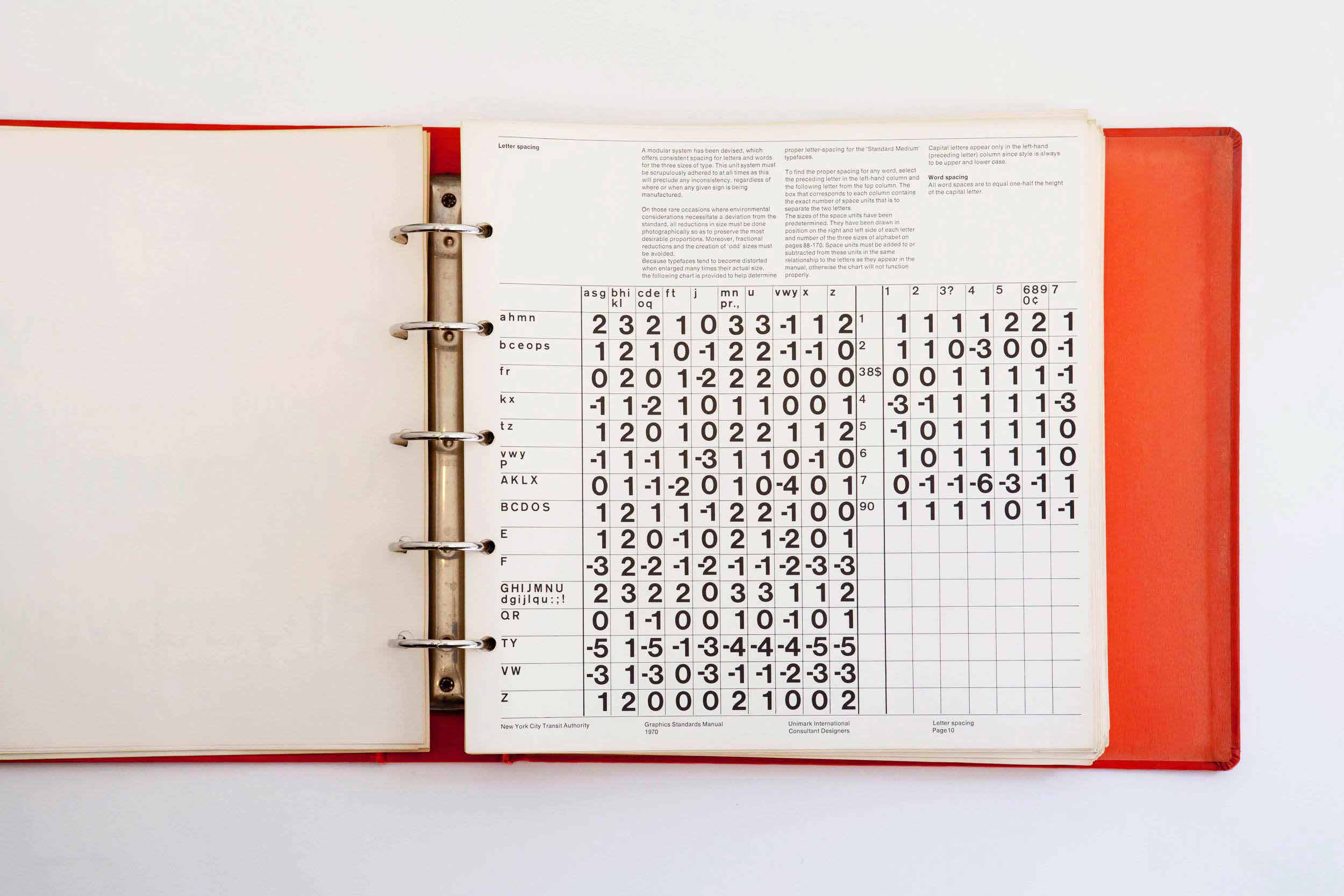
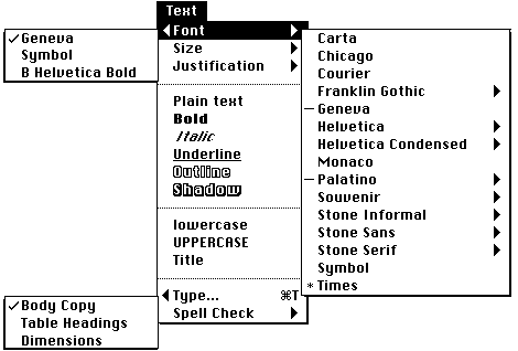
We love typefaces. They give our sites and applications personalized feel. They convey the information and
tell a story. They establish information hierarchy. But they’re also full of problems. Typefaces make our
websites slow. They produce
FOUT — or FOIT if you
prefer. They render in unpredictable ways. Why should we live with inflexible type that doesn’t scale, when
the core nature of our medium is fluid and responsive?
Why should we live with inflexible type that doesn’t scale, when the core nature of our medium is fluid
and responsive?
TLDR; We don’t have to. Three weeks ago,
Apple,
Google,
Microsoft and
Adobe
introduced a new font format called Variable Fonts. In a gist, Variable Fonts provide the
flexibility of multiple fonts in a single file that can adapt fluidly to any type of screen or device. One
font, near infinite variations.
When using
web fonts today, you
have to load separate font files for each style and weight, resulting in long download times and
FOUT/FOIT. With Variable Fonts, we can
request just one highly optimized file including all the weights and styles of a typeface. This is a
tremendous shift that I see leading to richer, more responsive typographic experiences and vastly expanding
the possibilities for web typography.
Back in 2004, when I had just started my career,
sIFR was the hottest thing out there. It
was developed by Shaun Inman and it embedded custom fonts in
a small Flash movie, which could be utilized with a little bit of JavaScript and CSS. At the time, it was
basically the only way to use custom fonts in browsers like
Firefox or
Safari. The fact that this technique relied on Flash soon made it
obsolete, with the release of the iPhone (without flash) in 2007.
Our interfaces are written, text being the interface, and typography being our main discipline.
In 2008, browsers started eventually supporting the new CSS3
@font-face rule. It had already been a part of the CSS spec
in 1998, but later got pulled out of it. I remember the excitement when I managed to convince one of our
clients to utilize the new @font-face and rely on
progressive enhancement to deliver an
enhanced experience for browsers which already supported this feature.
Since my early days in the industry, I’ve grown to love type and all the little nuances that go into setting
it. In this article, I want to share some of the fundamentals that I’ve learned, and hopefully help you get
better at setting type for user interfaces.
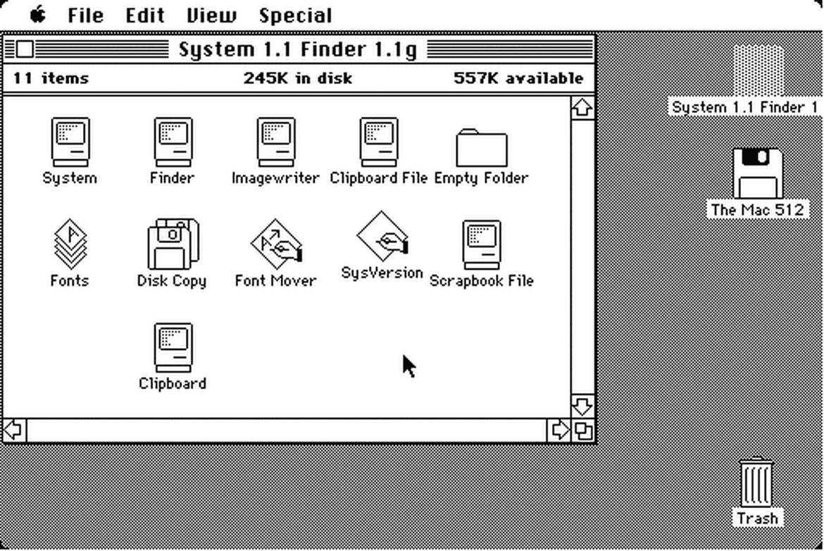
While the history of typography dates back about
five thousand years, we’ve had graphical user
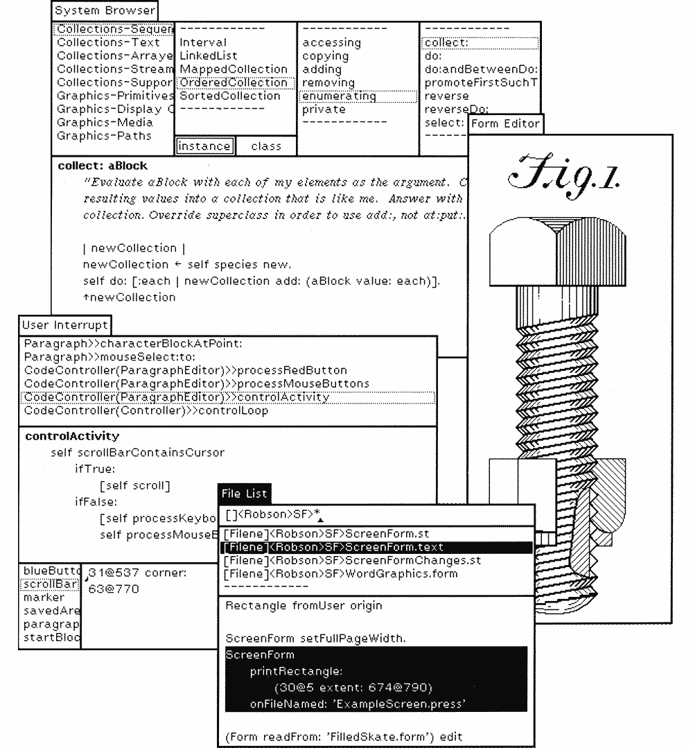
interfaces for mere four decades. One of the key turning points was in 1973, when
Xerox introduced
Alto, which in essence created the foundation for
today’s graphical UIs. Alto was born a decade before any other GUI hit the mass market, and was
seen as the future of computing.
This early development for Alto evolved to
Xerox Star in the 80s and became the first commercial
operating system with GUI.
Although neither Alto nor Star never really took off the ground, they greatly influenced
the future development at Apple and Microsoft with their revolutionary mouse-driven GUI. A couple years
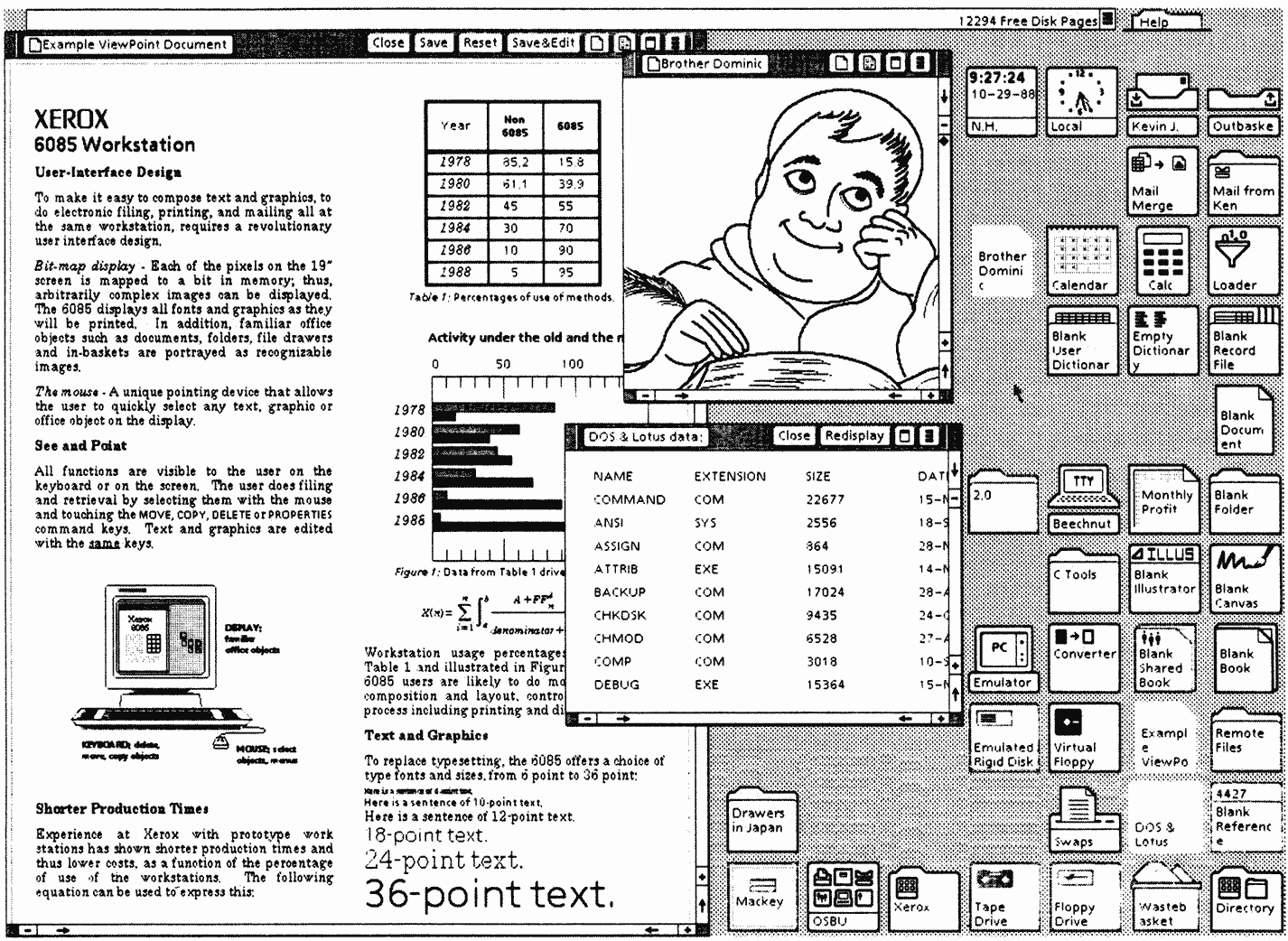
later, in 1984, Steve Jobs introduced the first
Mac OS.
The release of the Macintosh meant custom typography suddenly becoming available to the masses for the first
time ever. The original Mac came pre-installed
with many iconic typefaces, and over the next
few years, multiple type foundries started releasing more and more digital versions of their popular
typefaces.
When inspecting these early graphical user interfaces closer, we realize that most of their elements are
written language. These GUIs are essentially pure text — collections of singular words displayed in
isolation from one another.
We can make a similar observation by inspecting almost any modern interface too. Our interfaces are written,
text being the interface, and typography being our main discipline.
I’m terribly excited to tell that we’re moving to
San Francisco Bay Area in the beginning
of 2016! I’m joining a new company, Idean, as a Senior Interaction
Designer and Iisa will be starting preschool there, which makes this a tremendous change for the whole
family. All of this is something we’ve been planning for a while already, so we’re thrilled that it’s
finally happening.
As of today, we’ve packed everything we have—from the 12" record collection
to Iisa’s toys—into a
shipping container and it’s already in the
harbor waiting to get shipped to the United States. We’re still staying in Finland for the Christmas, seeing
relatives and enjoying some quiet time, before flying to San Francisco in January.
It’s been interesting few years at Adtile, and I’m grateful for all the
things I’ve learned, but it’s time to move on towards new adventures.
I designed the 3rd edition of this website almost 5 years ago,
which is an eternity by today’s standards. The previous version was one of the first responsive websites out
there that was built mobile first from start
to finish. Everything was also done progressive enhancement in mind, which made it last well throughout
the years.
Lately, however, I’ve wanted to learn to trust my own instincts more and let go of the imaginary feeling of
control we’ve created for ourselves.
But as with many personal projects, there eventually came a point when the content started becoming
obsolete, type didn’t work anymore like I wanted it to, and even updating the website became so terrible
experience that I just stopped doing it.
It was time to rethink. After some pondering, I came up with these 6 goals for the new version:
Build a design system.
Focus on the content, typography and readability.
Better performance and faster loading.
Switch to HTTPS and provide an offline experience.
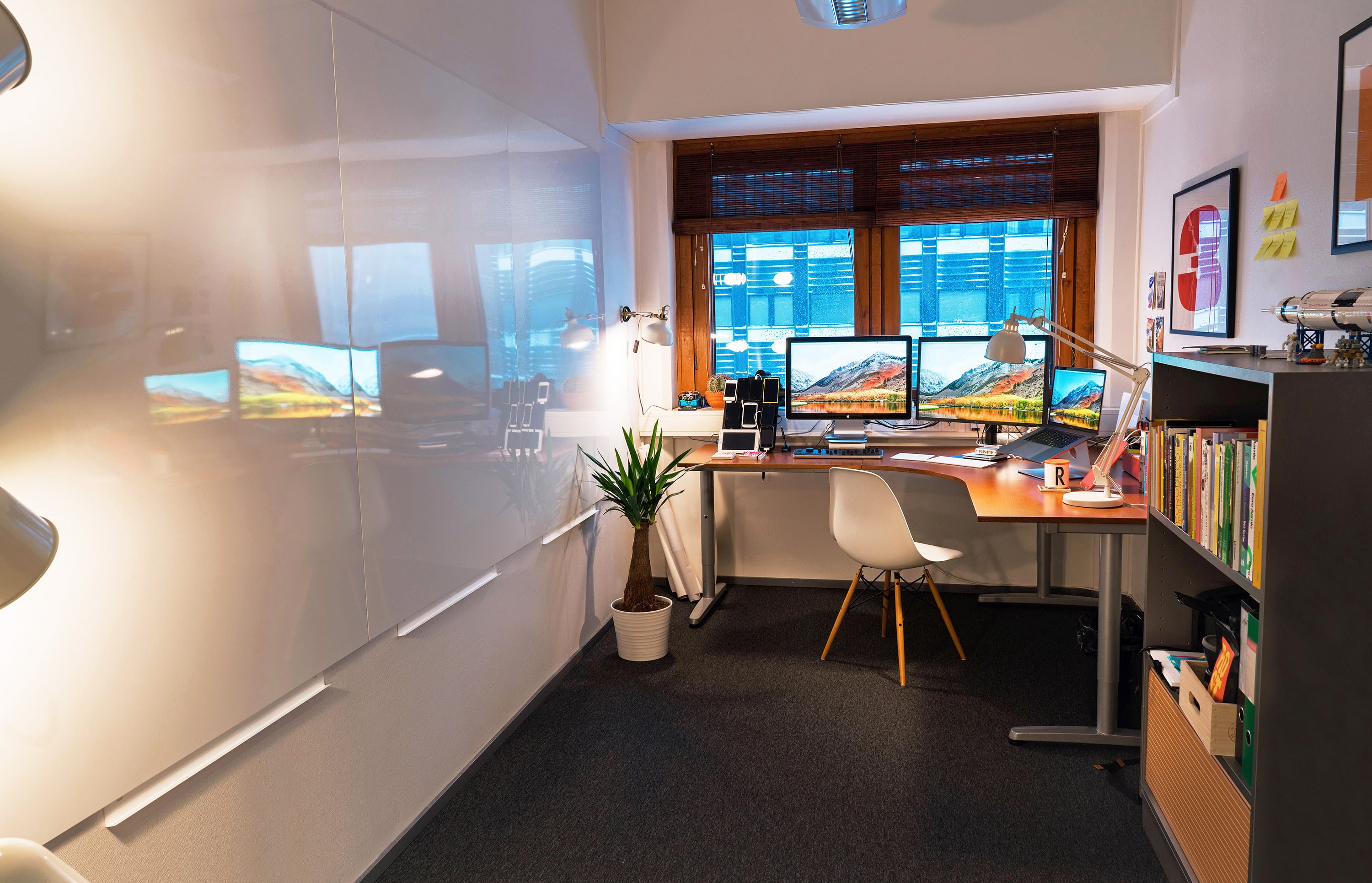 Workspace with lots of wall to draw on